
Monday, December 20, 2010
Traditionally, artists are isolated creatures, working in private in their studios and workspaces, thinking their own thoughts, contemplating their own images. No one else touches or alters that work. Thus, in this collaboration, the chosen artists are asked to step out of their comfort zone, allowing little known individuals to alter, change, and mar their work. Not an easy task. On the flip note, this idea of changing someone else’s work, creates new possibilities and new resolutions to images, moving their artwork and concept beyond their traditional limits. The collaborating artists receive dual benefit, flexing their own artistic minds, and reaching out to new members of the art community - starting a dialogue in the struggle to understand and create bridges where there had recently been chasms.
Collaborating artists include: Maria Arango, Las Vegas/Lynn Schmidt, Reno; Erik Beehn, Las Vegas/Nolan Preece, Reno; Bobbie Ann Howell, Las Vegas/Galen Brown, Carson City; Daryl DePry, Las Vegas/Sharon Tetly, Carson City; Keith Conley, Las Vegas/Sidne Teske, Tuscarora; Anne Hoff, Las Vegas/Vicki LoSasso, Reno; Jeanne Voltura, Las Vegas/Candace Nicol, Reno; and Juan D. Varela, Las Vegas/Ashlea Clark, Reno
Sunday, November 28, 2010
"The Geographical Divides Project was an amazing journey. I was able to take myself out of my comfort zone and truely dive into new processes and work with new people. My partner, Juan, was a joy to work with. Even though we had some obsticles to deal with, such as distance, time, launguage barriers and a large age gap, we were still able to punch out some amaizng work and have an amazing time doing it!" - Ashlea Clark
 |
| Born to Be On Fire Jaun Varela and Ashlea Clark |
 |
| Bridging the Gap Ashlea Clark and Jaun Varela |
I think I saw it more as a separate process from one artist to the other even though it was collaborative. My partner and I certainly saw each other a few times and had brief conversations in person about our general ideas about the prints. Mostly it was a note here and there via email. I think because of the distance and time management on my part, I had to be intuitive and work quickly to come up with a final concept and image to complete the print I had been given. I think Candace and I worked on things in the same or similar way, and I am sure that is why we were teamed up. Or, because of my time restrictions I think Candace understood and worked in a way that helped me to finish the portfolio. - Jeanne Voltura
 |
| Pleasure Garden Candace Nicol and Jeanne Voltura |
 |
| Divided Values Jeanne Voltura and Candace Nicol |
The principle idea behind this project, was to bring two separate groups together, to share dialogue, ideas and purposes to start an understanding and level of communication that had never existed before. Such as in any “peace-making” venture, the road to understanding starts with communication. What better venue than to ask artists to start this level of communication than a project? Historically, printmakers are artists who enjoy the sense of community that a printshop creates, and share their images, ideas and techniques with all. They are also able to produce multiples, thus increasing their reach to individuals outside their immediate community in “exchanging” their work.
Traditionally, artists are isolated creatures, working in private in their studios/workspaces, thinking their own thoughts, contemplating their own images. No one touches or alters that work, but themselves. Thus, in this collaboration, the chosen artists were asked to step out of their comfort zone, allowing little known individuals to alter, change, and mar their work. Not an easy task. On the flip note, this idea of changing some-one else’s work, created new possibilities and new resolutions to images, moving their artwork and concept beyond their traditional limits. The collaborating artists received dual benefit, flexing their own artistic minds, and reaching out to new members of the art community. Starting a dialogue, starting to understand and create bridges where there had recently been chasms.
This has not been a difficult journey, but an enriching and exciting trip. Which I hope for all will not be their last. - Anne M. Hoff
 |
| Along a Thin Line Anne Hoff and Vicki LoSasso |
 |
| Synergistic Divisions Vicki LoSasso and Anne Hoff |
"Erik Beehn and I had very few difficulties in resolving any differences we had simply because we are easy-to-get-along-with artists and we were willing to flex our schedules, ideas and techniques. We first laid out a time line and we stuck to it. Both of us had to compromise but we realized this was the best way to finish the job." - Nolan Preece
Well... The most difficult part for myself, which is also the best part in many ways, was the battle for a physical interaction with such a distance between paired artists. That also seemed to me to be the most successful element of the project for myself; Taking me out of my comfort zone, and introducing me to another artist, as well as a part of Nevada I was unfamiliar with. - Erik Beehn
 |
| Here, There and Between Erik Beehn and Nolan Preece |
 |
| The Milkman Nolan Preece and Erik Beehn |
I tend to be very flexible when “thinking” a woodcut print and do most of my designing with the cutting chisels. As a consequence, the thought of planning almost froze me and the thought of planning with a partner was fairly unnerving. But, adventurous as I claim to be, I just dove in and realized that my ability to “go with the image” as it develops for my own works was the perfect “training” for this sort of collaboration.
On my own print, I decided on a puzzle approach, thus liberating both myself and my partner from an excess of pre-planning. I actually completely liberated Lynn from any constraints and just gave her four little empty pieces of wood to do as she wished, staying within our chosen theme, of course. But as collaborations go, I couldn’t help but exclaiming: “Oh wow, I didn’t expect that!” when receiving my own little pieces back and when I first got Lynn’s block.
Back to my aforementioned “training” as a professional take-it-as-it-comes printmaker and I was able to adapt to a style and imagery completely foreign to my own. Taking a step in someone else’s world was nothing short of awesome. I worked in a much different way than I’m accustomed to work and yet I learned of myself that I’m adaptable to think in another artistic language without losing my way.
I’m a complete loner, when it comes to art and pretty much otherwise; working with my “partner in printmaking” (Lynn’s words) taught me that working with a partner is really a priceless enlightening artistic adventure. - Maria Arango
 |
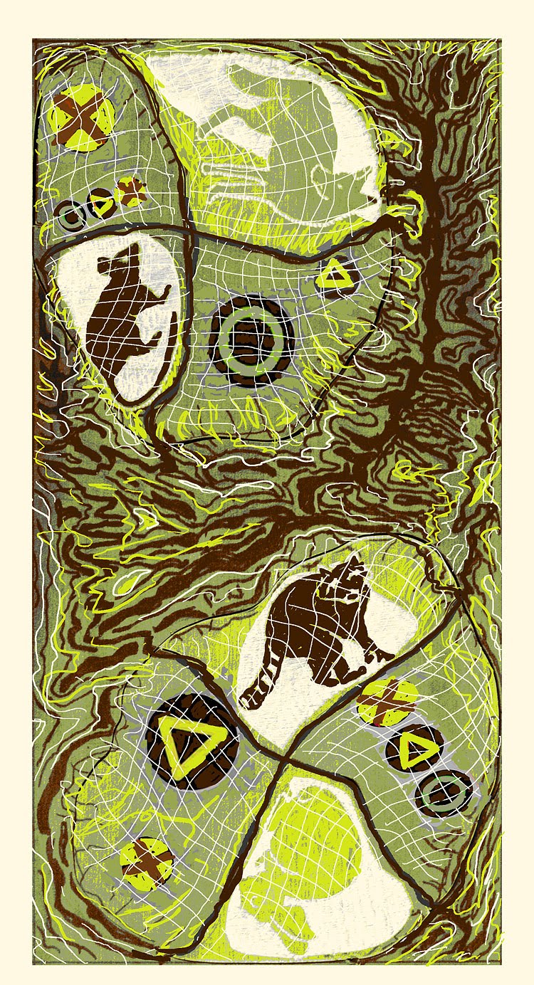
| Urban Rural Interface Lynn Schmidt and Maria Arango |
 |
| Terra Tribuo Terra Partis (Divided Earth, Shared Earth) Maria Arango and Lynn Schmidt |
I don't know if "a very difficult journey" is altogether accurate for me. Time, and distance were of course hurdles I imagine we all encountered, there was a fair amount of cussing associated with process and getting what I wanted from methods used.
As with any collaboration finding what will work with your partner, what processes, and the discussion of image concepts that have to be designed while learning about the other artist was challenging but not difficult, rather enjoyable actually. In this instance the collaboration was with someone I did not know so it was kind of a "blind collaboration" to be begin with. Galen is an exceptional artist and we luckily have some commonality in our working methods and a certain affinity for Nevada and some parallels in our growing up experiences his in the north mine in the south.
The deadline was a constant factor to get the work and complete edition done, to do work that your partner and project artists hopefully would like to have, to be able to present a work of quality and thoughtfulness were concerns of mine. There were various process problems that came with getting back into working in printmaking methods and relearning some techniques, having time to produce the outcome wanted, and in the end choosing a rather labor intensive method, but that happens often in my creative process and artwork production, always searching for what will work best for the concept. I was fortunate to be able to work with Galen several times over a period of days during the course of the project, that time I think proved to be invaluable, and I still hope my partner is pleased with what we created together. Other partners included Anne, Candace, Erik and Jeannie who were were on hand to provide discussion and assistance when the the battle with time, space, technique and the desire to create art was raging. Thanks to all. - Bobbie Ann Howell
 |
| Tracks Galen Brown and Bobbie Ann Howell |
 |
| Nevada Bobbie Ann Howell and Galen Brown |
Monday, November 15, 2010
Bobbie emailed these to me. They are some great photos showing our processes and collaborations.
 |
| Yep, a little too much Starbucks Coffee which is right around the corner from where Anne teaches. In Jan. 2010, some of us all met in Vegas to start the collaboration. We also printed up half the colophons then, too. Pictured: Candace Nicol and Anne Hoff |
 |
| Kate is showing us different ideas for the portfolio boxes she is making by hand. Pictured: Kate, Juan, Anne and Candace |
 |
| Summer 2010 - UP north at Oxbow Press, another gathering of artists working on the prints. Pictured: Anne, Sidne, and Candace |
 |
| Sidne Teske working out the technicalities of screenprinting. |
 |
| Anne Hoff drawing an image that will eventually be the screenprinted component to "Synergistic Divisions". |
 |
| Final layers of "Tracks" by Galen Brown and Bobbie Ann Howell |
 |
| "Nevada" by Bobbie Ann Howell and Galen Brown |
 |
| Erik Beehn working on his plate for "Here, There and Between". |
 |
| Digital component SALLY to Erik Beehn & Nolan Preece's print: "Here, There and Between". |
 |
| Blend ink on a big roller - for the relief component of "Tracks" by Galen Brown and Bobbie Ann Howell |
Monday, July 26, 2010

Tuesday, June 22, 2010

In any case, with Lynn's images in place, I started sketching in PhotoShop again. I wanted to keep the topo colors and somehow bring out the positive concept of sharing among urban/rural, rather than some of the more negative connotations that come to mind. I decided to add some urban elements since Lynn's critters pretty much took care of the rural part, and after some mulling and browsing, settled on semaphores (traffic lights for US folk :-). The "traffic lights" I picked had a hint of primitive symbols and, rendered in the topo colors, blend in quite nicely without losing meaning. Caution and courtesy, please, when urban and rural meet...
Let's catch up on progress. I carved my half of Lynn's block for Lynn and sent back to her a little while back.


Sunday, June 13, 2010
Hey Everyone,
Tuesday, May 11, 2010
Things are quietly moving along with our happy creation. As you know, we chose to do something along the lines of the dichotomy between rural and urban, generally speaking.
Lynn lives on the outskirts of the city and enjoys rural views from her urban digs. Maria lives smack in the middle of the city (formerly the outskirts!) in an acre with plenty of "elbow room" between neighbors, neatly simulating a tiny rural environment.
Anyhow, Lynn is in possession of my puzzle blocks and I am about done carving my part on my own block, plus the four pieces. I might do a color background on the...er, background, but that is to be decided.
In the meantime, I received Lynn's block, neatly carved with a variety of interesting images and shapes.
 This is a proof of the block, with my "blank canvas" at the bottom. I really liked the roof shapes and the shape of the vegetation-divider in the middle of the image, so I decided to replicate them.
Since I don't often sketch except right on the block, I had to revise the way I work. I took this very picture into Photoshop and proceeded to doodle on the bottom with my trusty graphic tablet pen.
I wanted those very interesting shapes to tie in my design and Lynn's so I simply copied and pasted some of her shapes with some stretching and replicating and mirror imaging and all that is possible with PS.
I find that looking at images very small on the computer screen helps balance compositions and blacks and whites. Also help in color schemes.
Lynn's rooftops became my mountains, the little house in the middle of the desert was "stolen" from Lynn's housing complex, the horses shrunk to fit the scale, and the bushes flipped and distorted to fill in the foreground and balance the blacks.


Friday, April 23, 2010

Monday, April 5, 2010

Thursday, February 11, 2010
Hi Lynn!
Here is the GRAND PLAN!!!
This is the BRAINSTORM

I wanted to do something with our idea of the dichotomy between rural and urban.
So I thought of maps and how our respective cities are representative of that concept. Cities in the desert are sort of like islands in the ocean, separated by a vast expanse of impassable terrain.
I dug up some topo maps and fell in love with that “spine” and decided to use as a separator, symbolic of the rugged desert ocean that lies between us.

Now, here’s the grand plan! ARE YOU READY??!
Today I am going to reinforce the design in permanent marker, this “sets” the concept on the block and gets me ready for carving. Then I will stain the block and let it dry to make it easy to see the carving.
NEXT! Comes the jig saw…

I am going to cut all those 8 “city” pieces out and scramble them so that our designs will either be in the north or south free to co-mingle with each other in a random way. You will get four and I will get four. They may end up together or separated, north or south.
Your MISSION, should you wish to accept it…is to design and carve four little scenes representative of our overall theme: rural/urban.
The pieces are about 4-5 inches wide or smaller and I will mark which way is UP on the back so you can orient your designs accordingly. Obviously working small will restrict detail and they really can be very simple, in fact preferably so. For example, one of mine I will carve a simple native American symbol representing a map/route, another will be a figure of a woman cross legged taking in the desert, another I may do a little skyline of the Strip merging into mountains, etc.
Once I receive your pieces and carve my pieces I will assemble the puzzle and print.
The background will be very light topo-like. The “spine” I will develop more in a three state reduction to resemble a topo map and its wonderful markings (I may have to carve a separate block). Our pieces will print over a very light background of yellowish/green. Once I get your pieces back I may carve some additional lines on them to integrate them with the background so they don’t look separated from the rest of the design.
Sounds crazy, I know, but these puzzle prints WORK! And they ROCK!
Any questions? Comments? I’m warming up the jigsaw…vrrrm vrrrm vrrrrrrrrm…
Maria


