
Tuesday, June 22, 2010

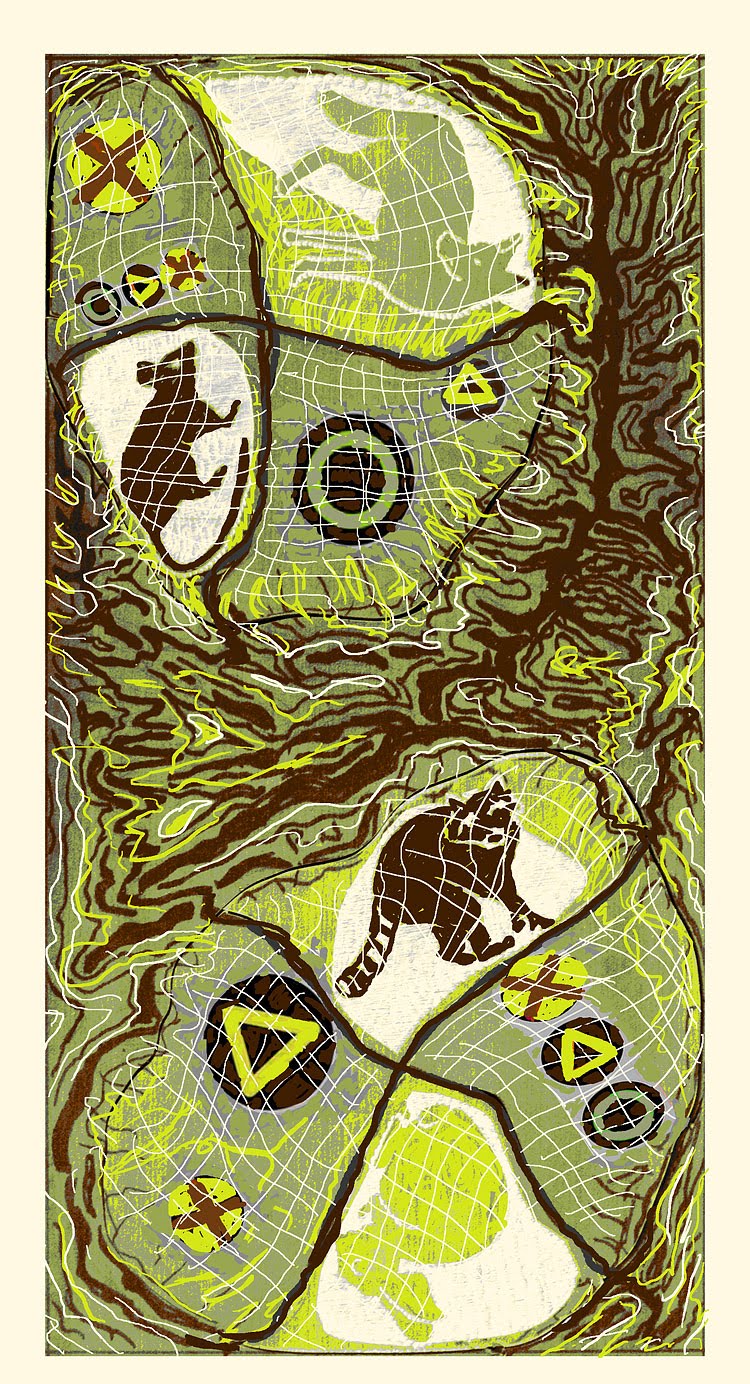
In any case, with Lynn's images in place, I started sketching in PhotoShop again. I wanted to keep the topo colors and somehow bring out the positive concept of sharing among urban/rural, rather than some of the more negative connotations that come to mind. I decided to add some urban elements since Lynn's critters pretty much took care of the rural part, and after some mulling and browsing, settled on semaphores (traffic lights for US folk :-). The "traffic lights" I picked had a hint of primitive symbols and, rendered in the topo colors, blend in quite nicely without losing meaning. Caution and courtesy, please, when urban and rural meet...
Let's catch up on progress. I carved my half of Lynn's block for Lynn and sent back to her a little while back.


Sunday, June 13, 2010
Hey Everyone,
Tuesday, May 11, 2010
Things are quietly moving along with our happy creation. As you know, we chose to do something along the lines of the dichotomy between rural and urban, generally speaking.
Lynn lives on the outskirts of the city and enjoys rural views from her urban digs. Maria lives smack in the middle of the city (formerly the outskirts!) in an acre with plenty of "elbow room" between neighbors, neatly simulating a tiny rural environment.
Anyhow, Lynn is in possession of my puzzle blocks and I am about done carving my part on my own block, plus the four pieces. I might do a color background on the...er, background, but that is to be decided.
In the meantime, I received Lynn's block, neatly carved with a variety of interesting images and shapes.
 This is a proof of the block, with my "blank canvas" at the bottom. I really liked the roof shapes and the shape of the vegetation-divider in the middle of the image, so I decided to replicate them.
Since I don't often sketch except right on the block, I had to revise the way I work. I took this very picture into Photoshop and proceeded to doodle on the bottom with my trusty graphic tablet pen.
I wanted those very interesting shapes to tie in my design and Lynn's so I simply copied and pasted some of her shapes with some stretching and replicating and mirror imaging and all that is possible with PS.
I find that looking at images very small on the computer screen helps balance compositions and blacks and whites. Also help in color schemes.
Lynn's rooftops became my mountains, the little house in the middle of the desert was "stolen" from Lynn's housing complex, the horses shrunk to fit the scale, and the bushes flipped and distorted to fill in the foreground and balance the blacks.


Friday, April 23, 2010

Monday, April 5, 2010

Thursday, February 11, 2010
Hi Lynn!
Here is the GRAND PLAN!!!
This is the BRAINSTORM

I wanted to do something with our idea of the dichotomy between rural and urban.
So I thought of maps and how our respective cities are representative of that concept. Cities in the desert are sort of like islands in the ocean, separated by a vast expanse of impassable terrain.
I dug up some topo maps and fell in love with that “spine” and decided to use as a separator, symbolic of the rugged desert ocean that lies between us.

Now, here’s the grand plan! ARE YOU READY??!
Today I am going to reinforce the design in permanent marker, this “sets” the concept on the block and gets me ready for carving. Then I will stain the block and let it dry to make it easy to see the carving.
NEXT! Comes the jig saw…

I am going to cut all those 8 “city” pieces out and scramble them so that our designs will either be in the north or south free to co-mingle with each other in a random way. You will get four and I will get four. They may end up together or separated, north or south.
Your MISSION, should you wish to accept it…is to design and carve four little scenes representative of our overall theme: rural/urban.
The pieces are about 4-5 inches wide or smaller and I will mark which way is UP on the back so you can orient your designs accordingly. Obviously working small will restrict detail and they really can be very simple, in fact preferably so. For example, one of mine I will carve a simple native American symbol representing a map/route, another will be a figure of a woman cross legged taking in the desert, another I may do a little skyline of the Strip merging into mountains, etc.
Once I receive your pieces and carve my pieces I will assemble the puzzle and print.
The background will be very light topo-like. The “spine” I will develop more in a three state reduction to resemble a topo map and its wonderful markings (I may have to carve a separate block). Our pieces will print over a very light background of yellowish/green. Once I get your pieces back I may carve some additional lines on them to integrate them with the background so they don’t look separated from the rest of the design.
Sounds crazy, I know, but these puzzle prints WORK! And they ROCK!
Any questions? Comments? I’m warming up the jigsaw…vrrrm vrrrm vrrrrrrrrm…
Maria