Monday, July 26, 2010


Pleasure Garden
Candace Nicol and Jeanne Voltura
4-color etching/gold relief with glitter embossment
Rives BFK white
10”W x 20”H

When I received Jeanne’s linoleum plate of the two women, I was inspired by what we have been discussing all along – the dichotomy of surface pleasures perpetuated in the gaming industry and the rawness of actual life in Nevada; the schema of rugged rurality, conservatism, and religious beliefs.  When I started to really think about the image, what kept popping into my mind were the gaudy carpets that Casinos place in their establishments.  I thought, “I’m going to place a sampling of one of these carpets in this piece.”  I started researching the different carpets and in the end chose the carpet from Atlantis: 1- It’s my favorite casino to go and eat at; and 2- It has a jungle theme, so immediately I was thinking how opposed that is to the Nevada landscape and how it eludes to the original sin which is inspired by the two figures that Jeanne carved out.
When Jeanne saw the finished piece, she wrote to me:
“I like to try to come up with titles ...you have me thinking about the garden idea in the statement you made when you were talking about your ideas...could call it Glitter Garden...also ties to rural life...could call it Golden Garden...or Gold Sparkle Garden...Golden Idle (Idol...Idle means to not move, so its about going nowhere...).... Idle Glitter...Glitter Idol...Glitter Gone Wild...Republic of Glitter...Glitter State.... Glitter Valley...All that Glitters is not Gold...I could keep thinking of things...but here is my thinking...I like the word glitter...but really like your ideas...they need to be woven together in the title somehow...to drive the meaning home...I was also trying to use the notion of conservatism somehow in the title but its too heavy...really like thinking about the pleasure idea...how hotels/gaming create this excessive, non-existent utopia within their establishments...how much that is opposed to the realities of living life in this state...or how life in general is very different...the stripper is a male symbol for selfish pleasure...but the realities of actually being a stripper are quite different...or they can be...I am sure that women who are in the adult entertainment industry get a little more than burnt out working within that realm of providing pleasure for their livelihood...Pleasure Garden would be good too...Pick the Right One could say a bunch about choosing a lifestyle and also the excesses of casinos...like which girl should I choose to marry...when I was making the image the old cliché of thinking of the Madonna whore thing kept coming up in my mind...how men look for a woman that is virtuous but really deep down want her to be extremely sexual in the negative version of that word...also was thinking about the south and north being considered differently. I think that in my mind, I view Reno/Tahoe/Carson City as being represented by the good woman, and Las Vegas being represented by the stripper.

Tuesday, June 22, 2010

Maria Lynn progress part deux

I had to go see what I had already posted. My topo/puzzle idea came to life when I received Lynn's puzzle pieces. We had talked about keeping the individual images simple and I was pleased with her choice of imagery. Lynn will be pleased to know that the rat transplant went without a hitch (perhaps she can further explain that one!).
Just to refresh, we had gone with the theme urban/rural and how somehow we work things out with natural things when we live on the edge of a city (as Lynn does) or smack in the middle but with an acre of desert "elbow-room" as I do. On a bigger scale, of course, every city in Nevada deals with the issue of sprawling into the habitat of the few and hardy creatures with whom we share our beloved desert.

In any case, with Lynn's images in place, I started sketching in PhotoShop again. I wanted to keep the topo colors and somehow bring out the positive concept of sharing among urban/rural, rather than some of the more negative connotations that come to mind. I decided to add some urban elements since Lynn's critters pretty much took care of the rural part, and after some mulling and browsing, settled on semaphores (traffic lights for US folk :-). The "traffic lights" I picked had a hint of primitive symbols and, rendered in the topo colors, blend in quite nicely without losing meaning. Caution and courtesy, please, when urban and rural meet...
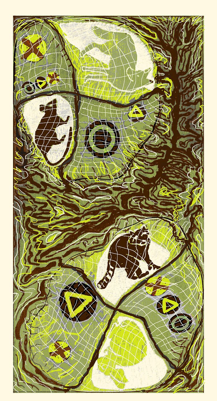
The computer is really a luxury when it comes to "sketching" and I don't use it often enough to develop my imagery. When I do, I find it most exciting to change imagery, save stages, tweak elements of design here and there, change color schemes...luxury!
I even changed the "paper" several times to see what the image would look like printed on various choices. Here is the almost-to-be-final image. I need to let it gel for a couple of days and then it should only be about another week or two for carving and printing. My Valley of Fire show concludes next week and I should be able to dedicate myself to this project fully and finish printing by the second week of July.

The sketch, reversed as it will be in print, a little messy in PhotoShop but will clean up and simplify nicely when printed because the woodcut process tends to do that. I think the colors will work well to represent both the topo features and the red/yellow/green of the traffic symbols. The "city grids" will probably also be finer and cleaner in line when cut on wood.
Comments welcomed!


Let's catch up on progress. I carved my half of Lynn's block for Lynn and sent back to her a little while back.

This is what it looks like, more or less. The top part was already carved and I (I think as usual) finished the bottom to complete the "narrative". It's a PhotoShop rendition of what I was going to carve but close enough to life.

Lynn is going to print using some color but I will let her tell you all about that. The picture of the block as carved below.

With that responsibility completed, I moved on to my block. Next post explains the process.

Sunday, June 13, 2010

Hey Everyone,


Just some updates for everyone. Hope all is going well in print land and that eveyone is doing well in getting their 20 print edition done for August 1st. We had a change in plans for the writer of our project... Jim McCormick was unable to do the writing component of the Geo. project, so we asked Fred Sigman to step in for the job. For those of you who don't know Fred, he is an accomplished photographer, art historian and art critic. I had the pleasure of working with him at CSN while he was our Art Historian, specializing in Tribal and Asian art studies. He is a long-time Nevadan, with ties to artists throughout the state.

He has requested contact information for all participants and will probably be giving many of you a call to talk with you and discuss your work.

We are glad to welcome Fred and his voice in this exciting project.!

Tuesday, May 11, 2010

The Lynn and Maria report!

Things are quietly moving along with our happy creation. As you know, we chose to do something along the lines of the dichotomy between rural and urban, generally speaking.
Lynn lives on the outskirts of the city and enjoys rural views from her urban digs. Maria lives smack in the middle of the city (formerly the outskirts!) in an acre with plenty of "elbow room" between neighbors, neatly simulating a tiny rural environment.

Anyhow, Lynn is in possession of my puzzle blocks and I am about done carving my part on my own block, plus the four pieces. I might do a color background on the...er, background, but that is to be decided.

In the meantime, I received Lynn's block, neatly carved with a variety of interesting images and shapes.

This is a proof of the block, with my "blank canvas" at the bottom. I really liked the roof shapes and the shape of the vegetation-divider in the middle of the image, so I decided to replicate them.

Since I don't often sketch except right on the block, I had to revise the way I work. I took this very picture into Photoshop and proceeded to doodle on the bottom with my trusty graphic tablet pen.
I wanted those very interesting shapes to tie in my design and Lynn's so I simply copied and pasted some of her shapes with some stretching and replicating and mirror imaging and all that is possible with PS.
I find that looking at images very small on the computer screen helps balance compositions and blacks and whites. Also help in color schemes.
Lynn's rooftops became my mountains, the little house in the middle of the desert was "stolen" from Lynn's housing complex, the horses shrunk to fit the scale, and the bushes flipped and distorted to fill in the foreground and balance the blacks.

After a few days of looking at the thing, I came up with three very close versions of what I wanted to do. Since Lynn chose to depict the urban environment with a little "rurality" for contrast, I chose to do just the opposite. Here are my sketches, you can play "find the differences" if you like. We decided on No.3 and I'm carving today as soon as I get off this chair.
The carving begins!


Friday, April 23, 2010

Nolan and Erik's Final Piece


North vs. South Nevada


Northern Nevada with its riches of gold, culture and history likes to think it is so far ahead of the Southern end of the state.  Upon closer examination however, the bulk of Nevada’s population is in the South giving it ever increasing political and financial power. 

Las Vegas and Clark County are represented here by a neon sign of a milkman, a symbol of life giving power.  He is exiting stage right with the milk money, leaving the symbols of mining, culture, history and even wild horses in a cloud of dust.   

Monday, April 5, 2010

;;